
Color is a fundamental element of graphic design. It shapes how viewers perceive your work, evokes emotions, and guides their attention. But with a vast spectrum of colors available, choosing the right ones can be daunting. This is where color theory comes in.
Color theory is the study of how colors interact with each other. It delves into the science of light and perception to explain how certain colors create harmony, contrast, and evoke specific moods. By understanding these principles, graphic designers can make informed decisions about their color palettes, crafting visuals that are both aesthetically pleasing and impactful.
The Building Blocks of Color
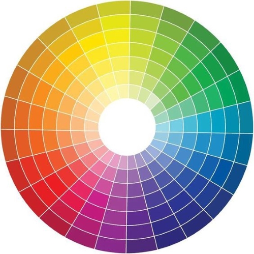
Our understanding of color begins with the color wheel. This circular chart organizes colors based on their relationships. The primary colors – red, yellow, and blue – form the foundation. Combining these primaries in equal parts creates the secondary colors: orange, green, and purple. Tertiary colors are formed by mixing a primary and a secondary color.
There are several ways to utilize the color wheel to create effective color schemes in graphic design. Here are some popular approaches:
- Complementary Colors: Colors directly opposite each other on the wheel provide a high level of contrast, creating a bold and vibrant composition. Think of a red and green Christmas scheme or a blue and yellow logo.
- Analogous Colors: Colors sitting next to each other on the wheel offer a harmonious and cohesive feel. This approach is ideal for creating a sense of calmness or tranquility. Think of a beach scene using blues, greens, and teals.
- Triadic Colors: Three colors evenly spaced around the wheel offer a visually stimulating and balanced scheme. It’s a good choice for grabbing attention and creating a dynamic composition.
Color Psychology in Design
Beyond aesthetics, colors carry inherent psychological weight. Understanding these associations allows designers to leverage color to evoke specific emotions and guide the viewer’s experience.
- Red: Associated with energy, passion, and excitement. Can also symbolize danger or urgency.
- Blue: Evokes feelings of trust, security, and peace.
- Yellow: Represents happiness, optimism, and warmth.
- Green: Linked to nature, growth, and harmony.
- Purple: Symbolizes luxury, creativity, and wisdom.
Putting Theory into Practice
Color theory is a powerful tool, but it’s not a rigid set of rules. Don’t be afraid to experiment and explore unexpected combinations. Here are some additional tips for using color theory effectively in graphic design:
- Consider your target audience. The cultural and social connotations of colors can vary.
- Maintain balance and hierarchy. Don’t overwhelm your viewers with too many colors. Use contrast strategically to draw attention to important elements.
- Test your color palette. Ensure your colors are legible and accessible, especially when considering color blindness.
Conclusion
By understanding color theory, graphic designers gain a powerful tool to craft visually compelling and impactful designs. From creating harmony to evoking emotions, color plays a critical role in shaping the viewer’s experience. So, the next time you sit down to design, remember the power of the palette and unleash your inner color maestro!
Article writer: Nourhan Awad
Sources:
- Interaction Design Foundation: What is Color Theory?
- GCFGlobal: Beginning Graphic Design: Color
- 99Designs: The fundamentals of understanding color theory